What We Do
Brand identity, Logo design
Industry
Restaurant
Paid
$150
Wordmark
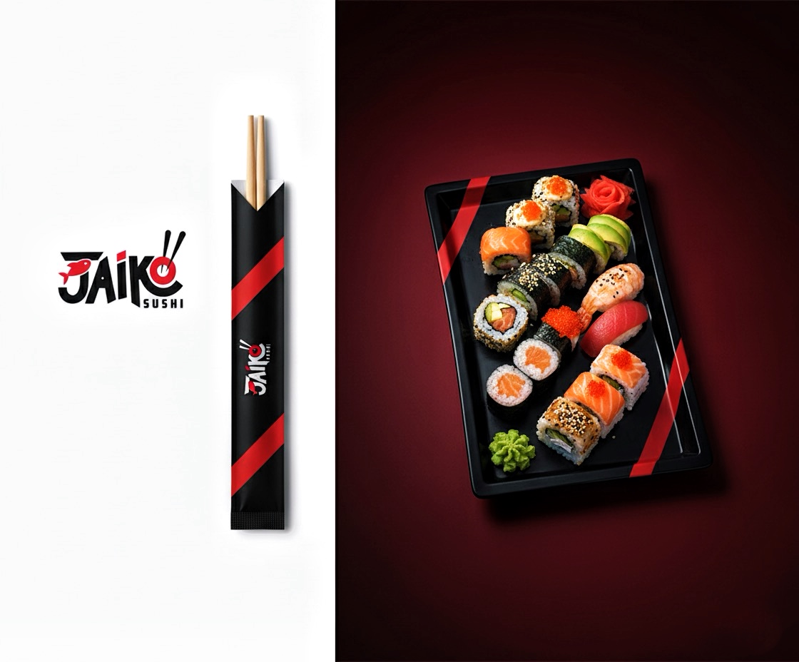
The primary element is the stylized wordmark "Jaiko Sushi.
The "Jaiko Sushi" logo is a contemporary and inviting design that skillfully blends traditional Japanese culinary motifs with modern graphic elements, creating a memorable brand identity for a sushi restaurant.
The core of the logo is the brand name "Jaiko Sushi." "Jaiko" is rendered in a custom, bold, black typeface with a slightly whimsical and dynamic feel. The letters appear hand-drawn yet refined, with varying stroke widths and a gentle upward curve, suggesting movement and vitality. "Sushi" is presented directly below "Jaiko" in a smaller, clear, all-caps sans-serif font, acting as a clear descriptor of the establishment's offering.
The logo primarily utilizes a high-contrast combination of black and red on a white or light background.
Black: Dominates the main "Jaiko" wordmark, conveying sophistication, quality, and a classic foundation often associated with Japanese aesthetics.
Red: Used as a vibrant accent color,
strategically placed to draw attention and evoke cultural significance. Red is prominent in Japanese culture
and suggests energy, passion, and good fortune, as well as the freshness of certain sushi ingredients like tuna.